
Architecture, Interior Design
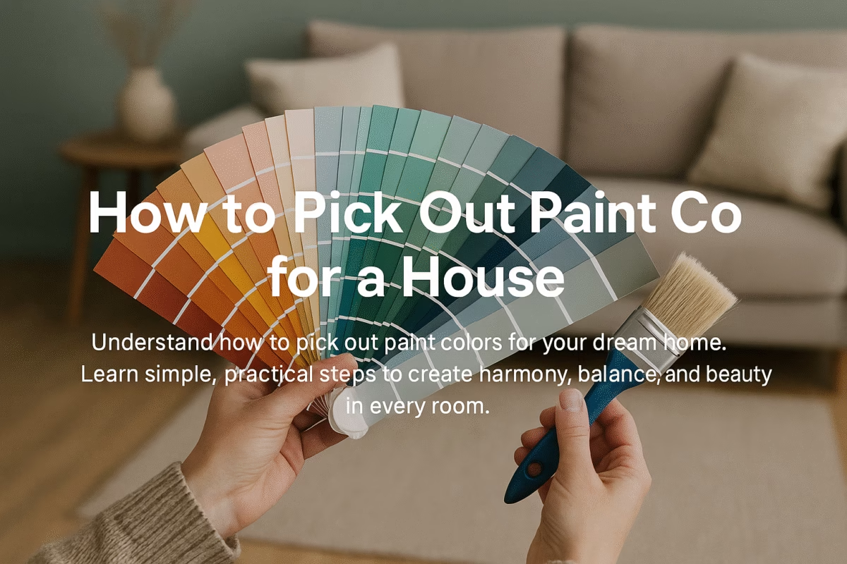
How to Pick Out Paint Colors for a House: 8 Best Steps
Oct
When you pick out paint colors for your house, you shape how it feels and looks. Paint is more than decoration. It sets the mood and tone of your home. The right color can make a small room feel open or a dark corner feel warm. It can calm your mind after a long day or fill you with energy each morning.
Color speaks before you say a word. A light blue wall whispers peace. A rich brown feels grounded and safe. A sunny yellow invites joy. The shades you choose tell your story to everyone who visits.
Paint also changes how you experience your space. A bright white wall reflects light and makes rooms feel clean and new. Deep tones like navy or forest green add depth and elegance. Every color has a voice. The secret is finding the one that matches your home’s personality.
Picking colors is not about following trends. It’s about choosing what feels right for you. Your home should make you feel at ease every time you walk in. When you choose wisely, paint can transform even a simple space into something special.
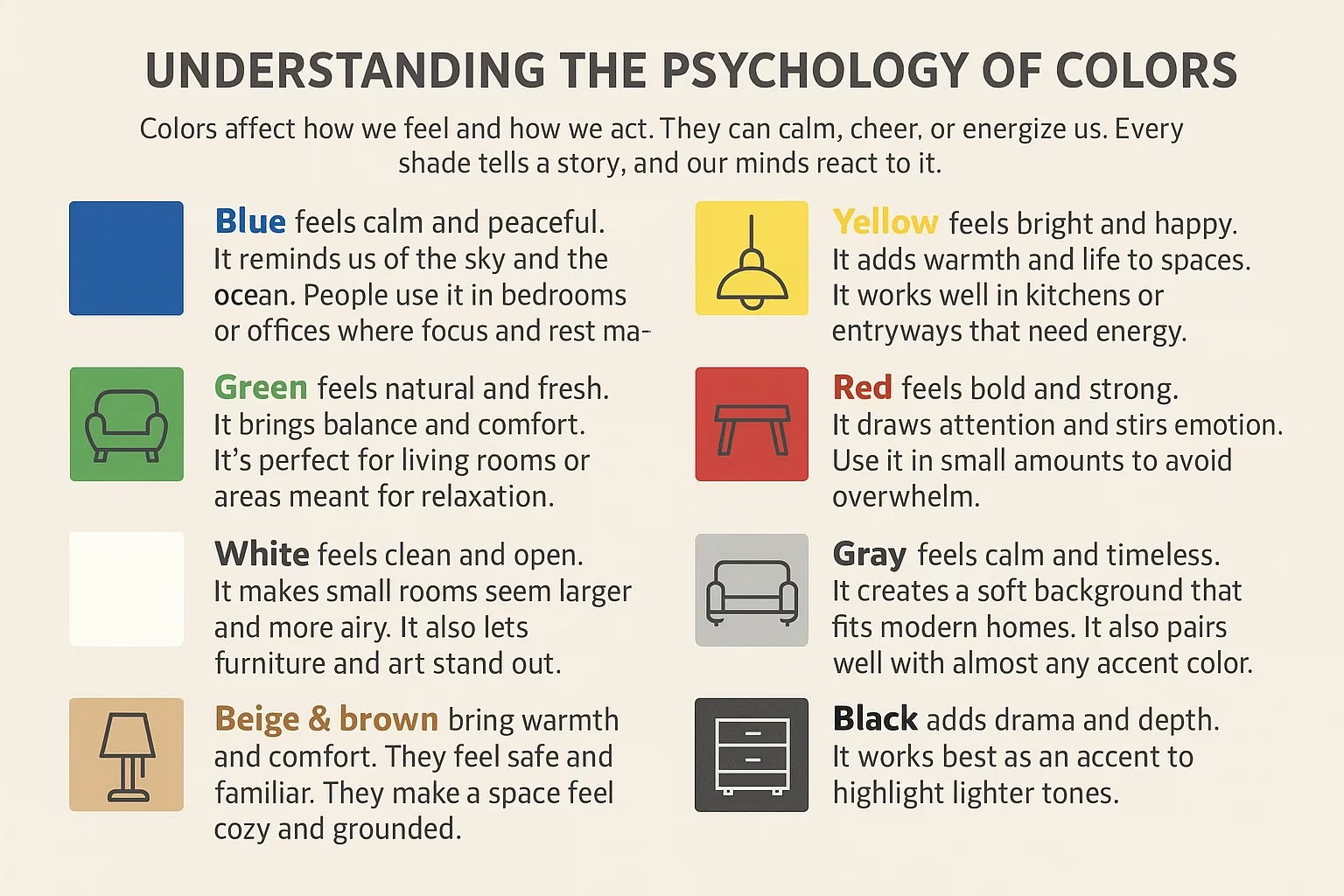
Understanding the Psychology of Colors
Colors affect how we feel and how we act. They can calm, cheer, or energize us. Every shade tells a story, and our minds react to it.
Blue feels calm and peaceful. It reminds us of the sky and the ocean. People use it in bedrooms or offices where focus and rest matter.
Green feels natural and fresh. It brings balance and comfort. It’s perfect for living rooms or areas meant for relaxation.
Yellow feels bright and happy. It adds warmth and life to spaces. It works well in kitchens or entryways that need energy.
Red feels bold and strong. It draws attention and stirs emotion. Use it in small amounts to avoid overwhelm.
White feels clean and open. It makes small rooms seem larger and more airy. It also lets furniture and art stand out.
Gray feels calm and timeless. It creates a soft background that fits modern homes. It also pairs well with almost any accent color.
Beige and brown bring warmth and comfort. They feel safe and familiar. They make a space feel cozy and grounded.
Black adds drama and depth. It works best as an accent to highlight lighter tones.
Color meanings can change from place to place. In Western homes, people often choose soft and neutral tones for a calm mood. In tropical regions, bright and bold colors fit better because they match the light and energy of the environment.
When you understand how colors affect mood, you can shape how your home feels. The right mix of colors can make each room serve its purpose better.
Exterior vs. Interior Paint Choices
The paint you choose for the outside of your home is not the same as what you use inside. Each serves a different purpose and faces different conditions.
Exterior paint must stand up to the weather. It faces rain, sun, wind, and dust every day. It needs to resist fading and cracking. In tropical areas, it must handle heat and humidity. In colder regions, it should protect against moisture and snow. A strong, weatherproof finish keeps your home looking clean and new.
Interior paint focuses on comfort and beauty. It sets the mood of each room and ties your design together. You can choose from many finishes; matte for calm spaces, satin for easy cleaning, or gloss for bold accents. Since it’s not exposed to harsh weather, it can be softer and more decorative.
Light also plays a big role. Outdoor light is stronger and changes through the day. A color that looks soft indoors can look much brighter outside. Indoors, lighting comes from bulbs or windows, so shades appear warmer or cooler depending on the source.
When choosing colors, consider the setting. Light colors outside reflect heat, which helps in tropical or sunny areas. Darker shades add warmth in cold climates. Inside, lighter walls open up small rooms, while deeper tones add depth and comfort to larger ones.
Your paint should match both your style and your surroundings. The exterior protects and impresses from the street. The interior welcomes and comforts you every day. Together, they tell one complete story about your home.
Step 1: When You Pick Out Paint Colors, Start With Inspiration
Every great color choice begins with inspiration. You can’t pick the right paint if you don’t know what look you want. Start by exploring ideas that match your taste and lifestyle.
Look through Pinterest, home design websites, and magazines. Save pictures of homes that make you feel something. Notice what colors appear often in your saved images. Patterns will start to show. Maybe you like soft natural tones or bright tropical shades.
Take a walk around your neighborhood. Pay attention to homes that stand out. See how sunlight and shadows change the colors during the day. Sometimes the best ideas come from real houses nearby, not from screens or catalogs.
Visit paint stores and look at sample walls. Hold color swatches against each other to see what fits. Don’t rush this step. Your choice will shape how you feel in your home every day.
Also, think about nature around you. The sky, trees, or ocean can guide your color choices. A home near greenery may look better in earthy tones. A coastal home might shine in soft blues or whites.
Inspiration is not about copying someone else’s design. It’s about finding what feels right for you. When you collect ideas, you begin to see your own taste take shape.
Step 2: Consider Your Environment
Your surroundings play a big role in how colors look and feel. The same paint can appear completely different in another location. Light, weather, and landscape all affect your final choice.
If you live in a tropical area, heat and humidity matter. Bright colors like white, aqua, or yellow reflect sunlight and keep your home cooler. Paints made for moisture resistance are better since they help prevent mold and fading.
In cold climates, darker shades can bring warmth and comfort. Deep reds, browns, and warm grays absorb light and make spaces feel cozier. They also hide dirt from snow and rain better than lighter colors.
Your natural surroundings can guide your color palette too. A home near the ocean may look best in cool blues or soft grays. A house surrounded by trees might blend beautifully with greens and earthy tones. Matching your environment helps your home feel part of the landscape.
Think about the amount of sunlight your home gets. A color that looks perfect in a shaded area may appear too bright under full sun. Try to view paint samples at different times of day before choosing.
Your environment is more than a backdrop. It shapes how people see your home and how you feel living in it. Choosing colors that respect your climate and surroundings creates harmony and lasting beauty.
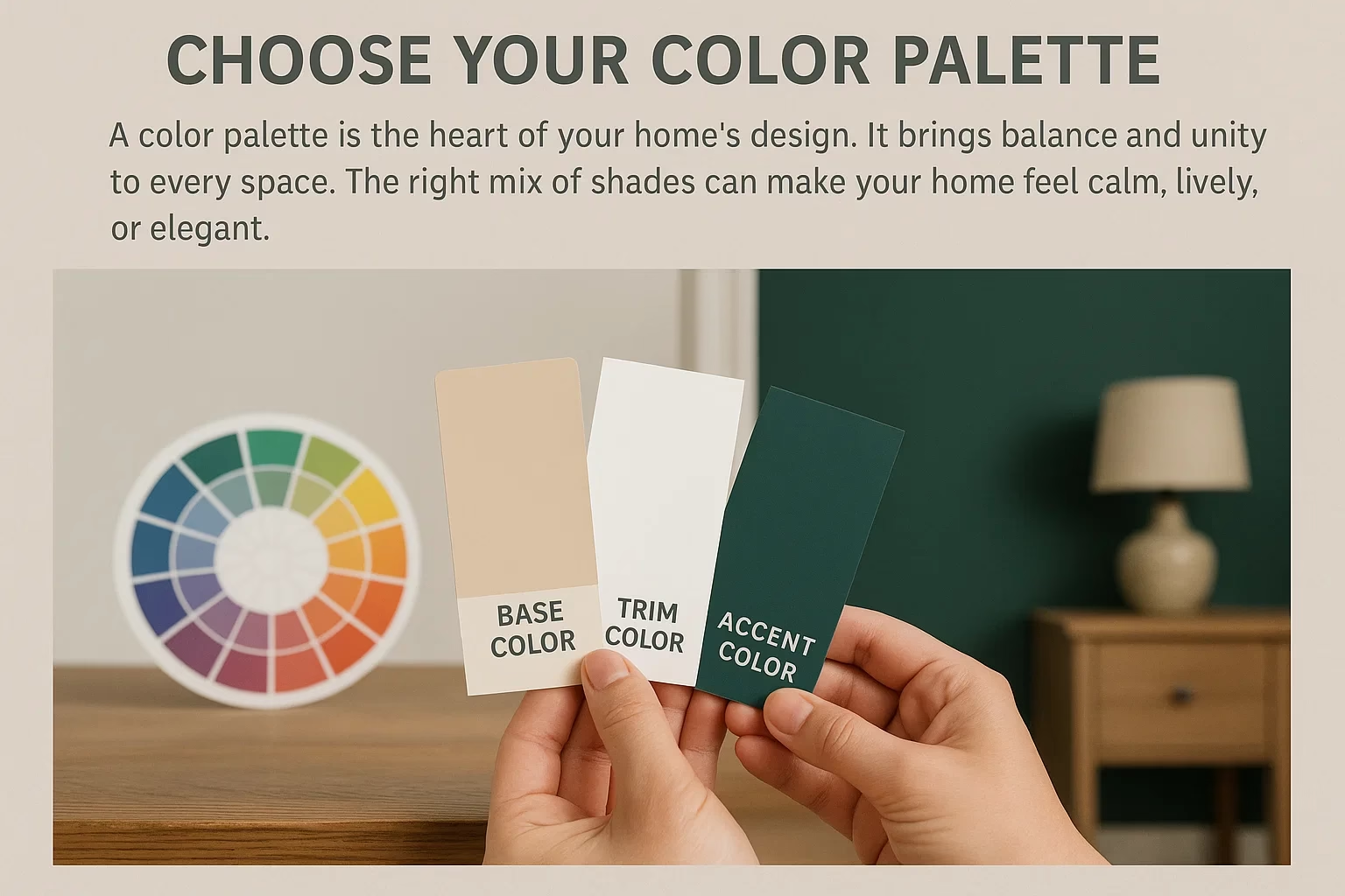
Step 3: Choose Your Color Palette
A color palette is the heart of your home’s design. It brings balance and unity to every space. The right mix of shades can make your home feel calm, lively, or elegant.
Start by choosing three main colors. Pick a base color for most walls, a trim color for doors and frames, and an accent color for highlights or features. This simple rule keeps your design clean and easy to manage.
Your base color sets the tone. Light neutrals like beige, white, or pale gray make rooms look bright and open. Darker tones like navy, charcoal, or deep green add warmth and drama.
Your trim color adds definition. White or off-white trims create a crisp edge, while darker trims frame walls beautifully. Trim shades also help connect your interior and exterior for a consistent look.
Your accent color adds character. Use it on one wall, furniture, or small details. A pop of color draws the eye and breaks monotony. Keep accents limited so they stand out without overpowering the space.
Use a color wheel to find what works together. Opposite colors create contrast and energy. Colors next to each other on the wheel create harmony. If you want a peaceful look, stay within the same color family.
Always test your palette before painting. Hold paint samples side by side to see how they blend. Natural and artificial light can change how each color appears. A balanced palette should feel pleasing in any lighting.
Your color palette should reflect your taste and lifestyle. Whether you love soft earthy tones or bold modern shades, choose colors that make you feel at home. The right palette ties every element together and gives your house a finished, thoughtful look.
Step 4: Test Before You Commit
Never choose a color based only on a photo or a small swatch. Paint behaves differently once it’s on your wall. Testing helps you see how light, space, and texture change the color’s look and feel.
Buy small sample cans of your top choices. Paint a square about two feet wide on different walls in the same room. This lets you see how the color reacts to sunlight, shade, and indoor light.
Check the color at different times of day. Morning light can make a color look cool and fresh. Afternoon light can make it warmer and softer. Evening lighting can make it appear darker or dull. Seeing it in every condition helps you avoid surprises.
If you’re painting the exterior, test on a shaded and a sunny wall. Weather, shadows, and reflection from nearby surfaces affect outdoor colors. A shade that looks perfect in the store might appear too bright in direct sun or too dull under clouds.
Let the paint dry fully before judging. Wet paint is darker than the final color. Step back and view it from different distances to see how it blends with surroundings.
Testing may take extra time, but it saves money and regret later. Once you find a color that stays beautiful under all light, you can move forward with confidence. The small effort of testing ensures the color you choose feels right every single day.
Step 5: Match with Existing Elements
Your wall color should work with what already exists in your home. Paint is easier to change than floors, furniture, or roofing, so use these as your guide. When colors connect well, the whole space feels natural and complete.
Start with the roof if you’re painting the exterior. A gray roof pairs nicely with white, beige, or blue walls. A red or brown roof looks better with cream, tan, or warm earth tones. The goal is to blend the roof and walls so neither overpowers the other.
Inside your home, look at your floors. Wood floors have natural warmth that matches well with soft, neutral shades. Dark floors work best with light walls that balance the room. Tile or stone floors may need cooler tones like gray or white to create harmony.
Your furniture also affects color choice. A bold sofa or cabinet can act as an accent piece, so choose wall colors that let it stand out. If your furniture is simple or neutral, you can bring energy through brighter walls or trims.
Don’t forget fixtures and fittings like countertops, curtains, and doors. These elements may carry undertones that can clash or blend with paint colors. A cool-toned gray wall might not fit next to a warm beige counter. Always test colors beside these features to be sure they align.
For outdoor spaces, think about landscaping. Green lawns, stone paths, or colorful flowers all influence how your paint looks. A natural background works best with soft, muted tones that complement rather than compete.
When every element connects, your home looks intentional and balanced. Matching paint with existing materials saves time and cost while keeping your design consistent. It also gives your home a polished look that feels both comfortable and complete.
Step 6: Think About Your Home’s Architecture
Your home’s design should guide your color choices. The shape, style, and details of a house all affect how paint looks. A color that fits one type of home may feel wrong on another.
Start by looking at your home’s style. A modern house often looks best with clean, simple colors like white, gray, or black. These shades highlight sharp lines and flat surfaces. A traditional or colonial home fits better with warm tones such as beige, cream, or olive green. These colors add comfort and a timeless feel.
For Mediterranean or coastal homes, lighter colors reflect sunlight and keep the walls cool. White, sand, and soft blue tones work well in bright climates. Rustic homes with stone or wood finishes look better in earthy colors like brown, terracotta, or muted green.
Pay attention to architectural features such as trims, windows, and columns. Use contrast to draw attention to these details. A light wall with dark trims can make windows stand out. For a softer look, use shades from the same color family.
Consider the size and shape of your home. Light colors make small homes appear larger and more open. Darker shades give large homes a grounded, strong look.
Your home’s age and materials also matter. Brick, stone, and wood all have natural colors that affect how paint appears. It’s best to choose shades that blend rather than compete with these textures.
When paint matches your home’s architecture, it enhances both beauty and character.
Step 7: Don’t Forget Lighting
Light changes everything about how color looks. A shade that feels perfect in the store can look completely different in your home. Both natural and artificial light affect how paint appears on walls.
Start by studying natural light in each room. Spaces with large windows or open layouts get more sunlight. Bright light makes colors appear lighter and cooler. A soft gray may turn pale blue in strong daylight. Rooms with little sunlight make colors appear deeper or warmer.
Pay attention to the direction of light. North-facing rooms get cooler, softer light that can make warm tones look muted. South-facing rooms get bright, warm light that brings out yellow and red undertones. East-facing rooms glow in the morning and cool off later in the day. West-facing rooms stay dim in the morning and glow warmly in the evening.
Artificial light changes color too. Warm bulbs add yellow or orange tones that soften a room. Cool bulbs make spaces look crisp but may dull warm colors. Test your paint under both types of lighting before you decide.
For outdoor paint, light is even more powerful. Sunlight, shade, and reflection from nearby surfaces all affect the final look. A white wall near trees may take on a green tint. A bright color can feel much stronger in full sun. Always test exterior colors at different times of the day.
Lighting can make or break a color choice. The same paint can feel cool and calm in daylight but rich and cozy at night.
Step 8: Keep Harmony Between Rooms
A home feels peaceful when colors flow smoothly from one room to another. Each space can have its own look, but the colors should still feel connected. Good harmony makes your home look organized and welcoming.
Start by choosing a main color theme that runs through your entire home. This could be a soft neutral or a gentle tone like beige, gray, or white. Use this color on large areas such as hallways or living room walls. It becomes the base that ties other rooms together.
Then, choose complementary shades for each room. Bedrooms may use lighter versions of your main color for a calm feeling. Kitchens or dining rooms can use brighter tones to add energy. Keeping similar undertones helps maintain unity.
In open floor plans, smooth transitions matter even more. Avoid strong color changes that break the flow. Use small shifts in shade or texture to define areas without creating harsh borders. Rugs, curtains, and furniture can also help separate spaces without losing balance.
Accent walls are a simple way to bring variety. A single bold wall adds depth without clashing with nearby rooms. Repeat hints of that accent color in small details like pillows, art, or decor pieces.
Lighting also affects how colors flow between rooms. Natural light moves differently through spaces, changing how paint looks. Always check that your chosen colors stay balanced when viewed side by side.
Harmony is about creating connection, not uniformity. Each room can show a bit of personality while still belonging to the same story. When your colors blend naturally, your home feels calm, comfortable, and complete.
Popular Paint Trends Around the World
US & Canada: Earthy neutrals, off-whites, and soft greens dominate.
UK: Deep blues, sage greens, and classic cream tones.
Asia: Bold reds and golds for energy and prosperity.
Tropical Countries: Aqua, coral, and lemon yellow for vibrancy and light reflection.
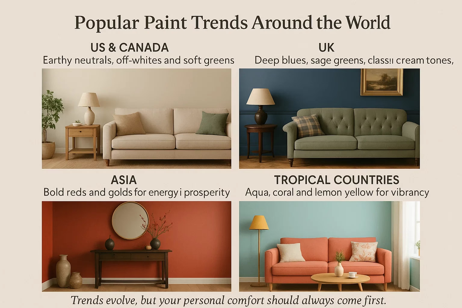
Trends evolve, but your personal comfort should always come first.
Conclusion
Picking the right paint colors isn’t about following trends. It’s about telling your story through color. Whether you live in a barn-dominium in Texas, a cozy bungalow in Nairobi, a townhouse in London, or a condo in Toronto, your walls should reflect you.
If you’re building or remodeling, Nyolenju Structures can help you bring your dream home to life; from customized floor plans to professional finishes that suit your climate and taste. Let your home speak your language beautifully, boldly, and confidently.
FAQs
1. How do I choose colors that make my house look bigger?
Use lighter shades and paint trims slightly lighter than walls to create an open, airy illusion.
2. What paint colors increase home value?
Neutrals like beige, gray, and soft white appeal most to buyers because they’re versatile and timeless.
3. Should I paint the ceiling the same color as the walls?
Only if you want a cozy, enveloping feel. Otherwise, lighter ceilings make rooms feel taller.
4. How can I maintain paint in humid areas?
Use mildew-resistant, washable paints and ensure proper ventilation.
5. Who can help me choose the best colors for my new home?
Consult with Nyolenju Structures. They are experts in climate-friendly designs and color selections that enhance your home’s value and comfort.